Business tips
14
min read
Great design doesn’t happen in isolation. Even the most talented designers need a second set of eyes, someone to catch what they missed, challenge their ideas, or simply ask, “But… why?”
At TodayMade, we get it. Peer reviews aren’t about tearing work apart. They’re about refining consistency, improving usability, and strengthening the creative vision. And we don’t just talk about it. We live it. Our designers run peer reviews constantly, handling the extra workload because we know better feedback leads to better design. It’s that simple.
While client feedback focuses on business goals and branding, peer reviews dive into the craft. We zero in on the details clients might overlook, like UX flow and accessibility or that one pixel that’s just slightly off, just as those fine details matter in how to create an ebook.
So, how does peer review work? In this guide, we’ll explain how to run a productive (not awkward) peer review, explore the psychology behind feedback, share field-specific best practices, and explore the tools top design teams swear by.
At its core, the peer review process is a structured feedback loop in which designers critique each other’s work to boost quality, consistency, and user experience. It’s not just about spotting mistakes. It’s about sharpening ideas and ensuring the design works.
Designers examine the nitty-gritty, such as typography alignment, UX flow, accessibility, and whether that micro-interaction really feels intuitive.
Feedback can be a double-edged sword. Designers often pour hours (and heart) into their work to make critique feel personal. But the best creatives know how to separate ego from feedback.
Still, our brains play tricks. Here are three common biases that sneak into peer reviews:

Recognizing these biases helps teams give sharper, more balanced feedback. However, it’s equally important to understand that peer reviews are essential for personal growth and skill development, creating stronger, more thoughtful designs.
A good peer review is a tool for constant improvement, making designs smoother and more impactful. Here’s why it matters:
Have you ever seen a brand whose one page uses sleek minimalism and the next looks as it has time-traveled from 2008? Peer reviews help spot these mismatches.
Fresh eyes on typography, color palettes, iconography, and spacing ensure that every element feels cohesive, whether it’s a single landing page or an entire product ecosystem.
Graphic designers can get so focused on aesthetics that they sometimes overlook usability. Peer reviews help bridge that gap.
A teammate might notice that a button blends too much into the background or that a key CTA isn’t obvious enough. They might also catch accessibility issues like poor color contrast or unreadable text on mobile that could turn users away.
Small design flaws can quickly turn into big (and expensive) problems if left unchecked. From the cost of illustrations to overall website design costs, even minor errors can lead to budget overruns and project delays. If a UX mistake slips past release, that fix could cost 100x more than catching it in the design phase.
Imagine launching a campaign only to realize the primary call-to-action leads nowhere or pushing a product update that breaks on mobile. A solid peer review can catch these issues early, saving time, money, and the occasional all-hands-on-deck crisis.
The traditional peer review process is about leveling up skills and strengthening teams. Juniors get hands-on insights from senior designers, while seasoned pros gain fresh perspectives that challenge their usual thinking. It’s a two-way street that builds more innovative, more cohesive teams.
An excellent peer review process example? Spotify’s design team. Their critique sessions go beyond polishing pixels. They focus on sparking ideas, encouraging open dialogue, and strengthening the final product. Spotify’s family of design systems, Encore, plays a key role in maintaining consistency across their platforms.
Within this system, a member of the Encore Web team is assigned as a peer reviewer. They review proposals to ensure they meet Spotify’s high-quality standards, either approving the work or requesting changes. This structured process keeps designs aligned while still encouraging creativity.

Peer review steps shouldn’t follow a one-size-fits-all approach because not all designs are created equal. What works for a UX project might completely miss the mark in a branding critique. To make feedback truly effective, the review process needs to adapt to the specific needs of each design type.
Here’s how to adjust your approach based on the project:
UX and product design are all about the user’s journey. A good peer review doesn’t just ask, “Does this look good?” It digs deeper: “Does this make sense to the user?”
Focus areas and what to review:
Pro tip: Use Figma’s prototyping tools to walk peers through user flows. Seeing it in action often highlights friction points static screens can’t.

Branding is all about storytelling. The peer review here should ask: “Does this design communicate the brand’s personality? Does it feel cohesive with existing materials?”
When teams manage multiple projects or scale quickly, graphic design outsourcing can be a game-changer. However, it makes peer reviews even more critical to maintaining brand consistency across internal and external teams.
What to review:
A solid peer review ensures that no matter who’s designing, whether an in-house team or an outsourced partner, every piece of work feels cohesive, intentional, and unmistakably on-brand. In this respect, these tools can help:

Functionality is just as important as form in web and UI design. Users won’t care how beautiful a site is if the buttons don’t work or the text is unreadable on mobile.
That’s why peer reviews in web and UI design should focus on how the site works just as much as it looks. And if your team lacks the expertise to get it right, it might be time to hire a website designer who can balance both.
What to review:
Common mistakes to catch:
Tailoring your peer review process for each design type means feedback hits where it matters most, improving the work and making it more effective for its end goal. Next, let’s explore how peer reviews fit into every stage of the design process.
A single peer review at the end of a project? That’s a fast track to last-minute chaos. The most effective teams integrate feedback throughout the design process, not just when it’s “done.”
Following clear peer review process steps at each stage can help designers catch issues early, improve collaboration, and avoid costly rework later.
Here’s how to integrate feedback at every key stage:
At this stage, it’s all about big-picture thinking. There's no need to nitpick button colors or font choices. Focus on structure, flow, and hierarchy.
What to review:
Pro tip: Encourage “Yes, and…” feedback. It’s a brainstorming mindset that builds on ideas rather than shutting them down.
This is where the skeleton starts taking shape. The goal? Make sure the design is usable before you add the finishing touches.
What to review:
Tools to use:
Now’s the time for pixel-perfect critique. Here, typography, color, and branding consistency take center stage.
What to review:
Watch out for:
A clean handoff makes everyone’s life easier. At this stage, the peer review ensures that everything developers need is clear, accurate, and usable.
A seamless handoff also helps hit key marketing KPIs like faster time-to-market, higher conversion rates, and fewer costly revisions. So, if you want to boost your marketing strategy, it starts here by eliminating confusion, reducing delays, and setting the dev team up for success.
What to review:
Pro tip: Use tools like Zeplin or Figma’s Inspect Designs mode to give devs easy access to specs and assets.

Running peer reviews throughout the process means fewer surprises and fewer fire drills before deadlines. But let’s be honest: getting feedback on your work can be tough. It’s easy to take critiques personally, especially when you’ve spent hours perfecting every detail. But in peer reviews, the goal isn’t to tear anyone down. It’s to build the design up — just like faq page best practices and storytelling for business aim to build clarity and trust.
Here’s how to give (and take) feedback that helps without sparking awkward silences or defensive vibes.
The way you phrase feedback makes all the difference. It’s not about sugarcoating or brutal honesty. It’s about clarity and intention.
Here’s how to do it right:
Avoid this:
Hearing, “This needs work,” can sting. However, taking feedback well is a skill that makes designers stronger.
Tips for handling critiques like a pro:
The best design teams don’t just tolerate peer reviews; they rely on them. For example, Airbnb teams structure their critique sessions around collaboration, not competition.
They follow a simple principle: “Critique the work, not the person.” It’s simple, but it keeps conversations productive and free of unnecessary tension.
This mindset shaped their Design Language System (DLS), a shared framework where designers and developers build together. This framework is a unified system where new components are co-created, named, and then built consistently across iOS, Android, React Native, and the web.

When designers see the bigger picture, such as how peer feedback leads to better outcomes, more cohesive branding, and standout graphic design examples, the team levels up. To achieve that kind of culture, you should:
An excellent process of peer review isn’t just about what you say. It’s about how you say it. The right tools can turn scattered, vague feedback into clear, actionable insights. Plus, they make collaboration smoother, whether your team’s remote, hybrid, or all in the same office.
Here’s a breakdown of the free business tools and workflows to keep feedback organized, efficient, and helpful:
When you need quick back-and-forth or want to hash out complex ideas, real-time reviews are the way to go.
Best for: Brainstorming sessions, team critiques, and projects that need fast iterations.
When teams are spread out or juggling packed schedules, async reviews let people give thoughtful feedback on their own time.
Best for: Remote teams, deep-dive critiques, or projects without immediate responses.
When peer reviews fit your team’s natural rhythm, you spend less time decoding vague comments and more time doing what matters: creating great work.
Different teams have different flows, and leading design teams know how to make peer reviews work for them:
Spotify’s design squad runs weekly critique sessions using Figma and Miro, following a clear UX-first approach. Instead of jumping straight into visuals, they analyze user flows and interactions first, ensuring a smooth experience before worrying about fonts and colors.
Also, Spotify’s teams use their trusted Working Group (WG) model, pulling together a crew of designers from across the company to ensure every business unit is represented. This cross-functional approach helps maintain consistency while bringing in diverse perspectives from different product areas.
It’s easy to get caught up in making something look beautiful, but if users struggle to navigate, no amount of aesthetic polish will save it. That’s why Spotify’s method prioritizes usability, clarity, and function before diving into the finer design details.
Google takes a data-driven approach to design reviews. Their teams rely heavily on user testing, A/B experiments, and real-time feedback loops.
Rather than debating what "feels right," they let data guide decisions. If a new button placement improves engagement by 12%, it stays. If it confuses users, it’s out. Their UX teams work closely with researchers and product managers to iterate quickly and refine based on real user behavior, not just internal opinions.
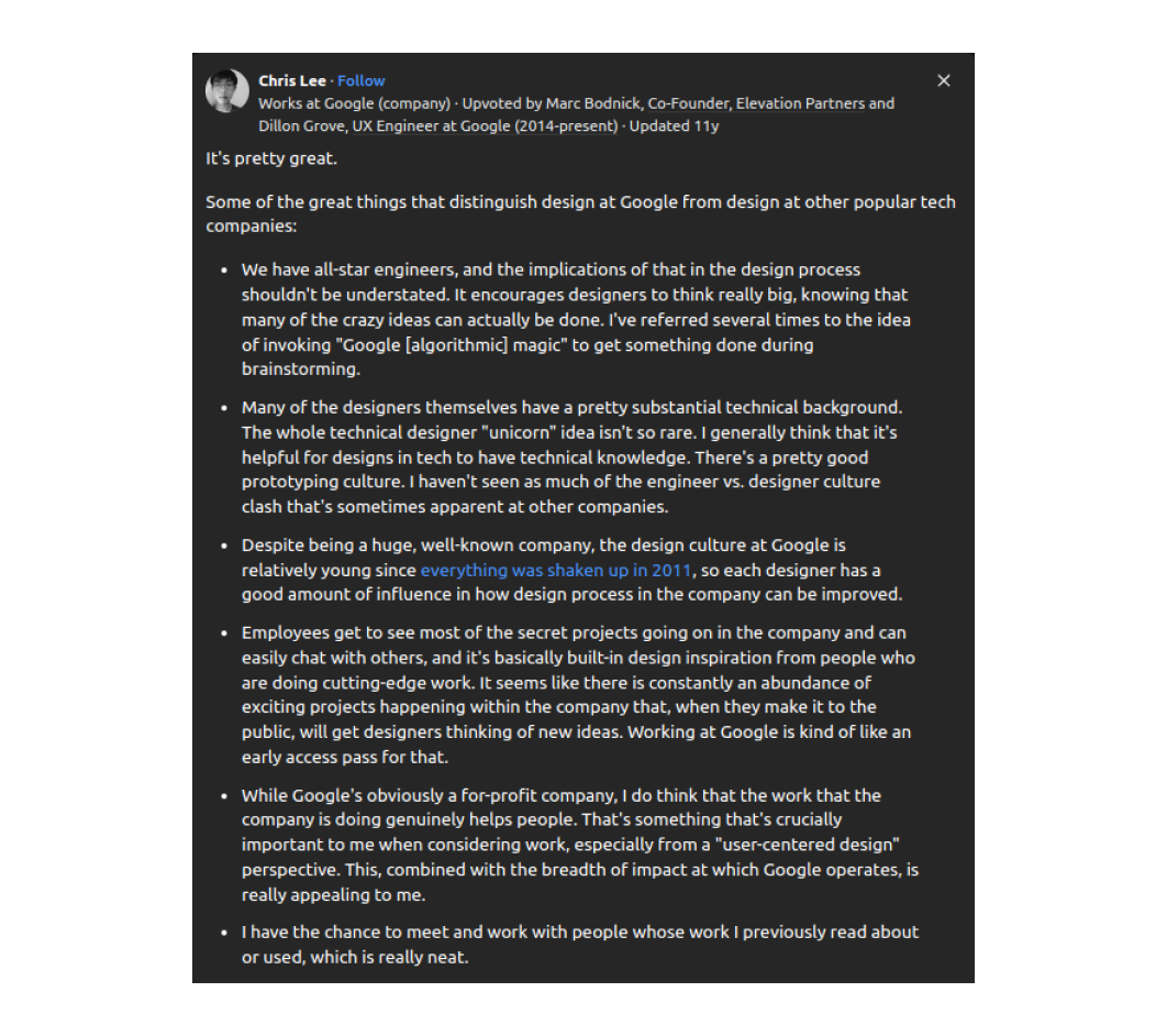
However, Google's built-in design inspiration approach makes its design culture unique. Designers get early access to secret projects across the company, sparking new ideas and collaborations.
As a Google designer, Chris Lee put it on Quora, “Employees get to see most of the secret projects going on in the company and can easily chat with others… It’s basically built-in design inspiration from people doing cutting-edge work.”
Figma teams rely on async peer reviews, where designers drop comments directly into design files rather than waiting for scheduled meetings. This creates a low-pressure, continuous feedback loop, allowing designers to review suggestions when they fit their workflow, not just when a meeting is on the calendar.
However, async feedback is just one part of the equation. Figma designers hold critique sessions every week, reviewing two topics per session (30 minutes each). Unlike formal reviews, these critiques aren’t about making major roadmap decisions. Instead, they’re designed to:
Most importantly, designers look forward to these critiques because they are motivating, not intimidating, and helpful, not discouraging. They are about refining work through shared expertise, not tearing it apart.
The result? Faster iteration, clearer communication, and fewer unnecessary meetings, exactly what Figma was built for.

Trello’s design team keeps things tight with Notion for running feedback lists and Figma for inline comments, ensuring nothing slips through the cracks.
Every project moves through a structured Kanban flow:
Concept → Draft → Peer Review → Refinement → Final Approval
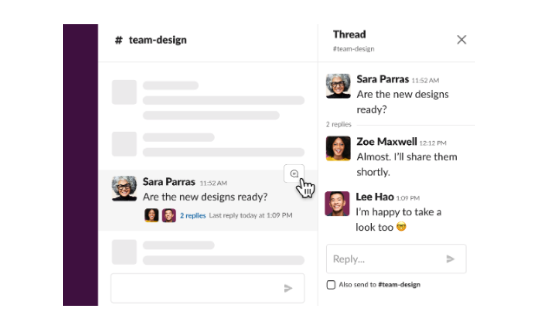
This ensures that every design is reviewed at key checkpoints and feedback isn’t lost in Slack threads or endless email chains. Their system also makes it easy to see what’s in progress, what’s approved, and what needs work, a dream for anyone who loves a well-organized to-do list.

Managing your workflows is all about setting your team up to give better feedback, make faster decisions, and create stronger designs. So, how do you choose the right workflow?
A strong review process is where good ideas become great, and great ideas turn into work you’re genuinely proud of, much like the refinement that comes from tips for writing a great blog and leveraging better blogging insights.
Whether you’re working with an in-house team, a freelance graphic designer, or an agency, the peer review process helps maintain consistency and quality across all projects. To integrate it effectively into your workflow, follow these key steps:
And if you’re weighing the choice between a freelance graphic designer vs agency, consider this: TodayMade marketing design agency doesn’t just deliver polished designs. We bring cohesive strategies, seamless collaboration, and a smoother, hassle-free process from start to finish. Contact us, and let’s make something amazing minus the stress.


