Business tips
16
min read
You’ve got a logo, a few colors, maybe a font. But the brand still doesn’t feel complete.
That’s because most people focus on making things look good without knowing what their design is supposed to communicate.
Studies show people form opinions about your website in 50 milliseconds. Is your visual identity making the right impression?
Think of Duolingo. Before you read a word, the playful colors and goofy owl tell you exactly what kind of brand you’re dealing with. That’s a visual identity design done right.

At TodayMade, we help brands design with intention, not guesswork. We specialize in brand visual identity and know how to make it work across websites, ads, emails, and more.
In this guide, we’ll explain:
By the end, you won’t just understand visual identity. You’ll know how to build one that works and how to use it across everything you design.
Visual identity refers to the elements used to represent a brand visually — logos, colors, typography, imagery, packaging, and more. It’s how a business visually expresses its personality and values to the public.
It’s what people notice first and what sticks in their memory. If brand identity is the soul of your brand, visual identity is its face. It’s how you show up across your website, emails, ads, social media, and more.
Let’s look at two examples that take very different approaches:
Everything about Amazon’s visual identity reflects its core values: speed, convenience, and reliability. The A–Z arrow in the logo signals you’ll find anything you need. The bright orange grabs attention, while clean fonts and clear layouts prioritize usability — a reflection of the brand’s practical, customer-first approach.

Now compare that to Oku.Club: a minimalist SaaS brand at first glance, but its hand-drawn illustrations add warmth and humanity. That visual choice aligns with its mission — being a gentle reading companion — and makes the brand feel personal. It’s not just design, it’s aligned storytelling.

Your visual identity should:
Up next: Why visual identity and brand identity aren’t the same and why that matters.
Here’s where a lot of projects go sideways: someone asks for a “brand identity,” but what they really mean is a logo, some colors, and a font.
But those are just visual elements, not the full brand.
Brand identity is the full personality of your business — your mission, values, voice, and positioning. It’s what you stand for, how you sound, and how you make people feel.
Visual identity is how that personality shows up visually. It’s your logo, typography, color palette, imagery, layout, and graphic style — the things that create a recognizable look and feel.

Think of it like this:
To make this distinction real, let’s look at some vibrant brands that use design to express who they are:
Intercom

Pitch

As one Redditor put it:

It’s simple and accurate: branding is what you stand for. Visual identity is how you show it.
This distinction matters because people often judge your brand based on its visuals, even if those visuals don’t reflect your values. When your visual identity and brand identity are aligned, everything feels consistent, confident, and real. When they’re not, people sense the disconnect.
But here’s the tricky part.
Even once you understand the difference between brand identity and visual identity, you might still feel stuck, especially if you don’t have a brand strategy in place yet.
So that brings up the next question:
Not always.
A full brand strategy — mission, positioning, messaging, tone of voice, audience personas — gives your visual identity direction. It aligns teams and ensures your design system supports business goals. If you have it, use it. But if you don’t? You’re not stuck.
For early-stage startups and small businesses, you can start simpler. You don’t need a 50-page brand book. What you do need is clarity: who you are, what you do, and how you want people to feel when they encounter your brand. That’s enough to begin creating a visual identity that aligns with your brand’s tone and values.
As your business grows, strategy becomes less optional. For B2B companies or scaling brands, a defined strategy is the backbone of consistency. It prevents visual drift and helps every design decision stay on-message, across every channel.
The key is fit — not formality. A local bakery doesn’t need brand archetypes. But it does need a legible logo, a consistent look, and packaging that feels as fresh as the pastries. Let context guide complexity.
Same goes for early-stage tech. When Hirerise came to us, they had no strategy doc, just tough deadlines and a need for a visual identity that felt modern and trustworthy. We designed a custom “HR” ligature to reflect connection, and chose a bold violet and teal palette to break away from the sea of corporate blues. No frameworks, no messaging pyramids — just smart, focused design that did the job.

That’s often how it starts. Sometimes, design leads the way, and strategy catches up later. If you’re building a visual identity without a full brand strategy, don’t get stuck. Just start with a few essential questions:
You don’t need a brand manifesto or an equity pyramid to begin. Just talk to the founder, the team, the people closest to the product, and ask what makes the business special. Then translate that insight into visuals.
Now that we’ve established strategy isn’t a prerequisite, let’s get practical. How do you actually build a visual identity that feels cohesive and not just cobbled together? Let’s walk through it, step by step.
A visual identity isn’t just a logo and some colors. It’s a system — a toolkit that helps your brand show up consistently across every touchpoint. Each element has a job to do, and when they work together, your brand feels intentional and real.
Here’s what matters and why.
Your logo isn’t your whole brand, but it’s often the first handshake. It should be more than a decoration — it should reflect something essential about your brand’s personality.
A great logo is:
Take Process Place, a workflow platform that TodayMade rebranded to feel more structured and forward-thinking. The logo combines a bold, geometric “P” with a stylized green arrow, representing both “process” and “progress.” It’s modern, versatile, and makes a strong impression across platforms.

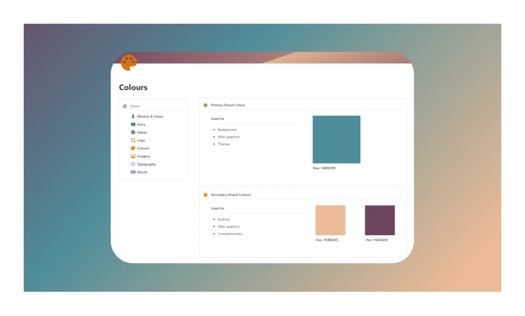
Color isn’t just a vibe, it’s one of the fastest ways your brand communicates feeling. But effective palettes aren’t random. They’re chosen based on the emotions you want to evoke and the context in which you’ll show up.
A good palette has:
When redesigning Refera, a healthcare referral platform, Today Made introduced a palette that blends calming seafoam green with a pop of burnt orange. It’s a combination that feels both professional and friendly — perfect for a product that needs to evoke trust and clarity.

Typography sets the tone before a single sentence is read. It should feel like your voice, quiet or loud, warm or cold, elegant or pragmatic.
What to think about:
In our rebranding work with SEO Alive, TodayMade selected Gilroy as the primary typeface and Nunito Sans as the secondary. Gilroy’s bold, geometric forms project momentum and modernity, while Nunito adds warmth and clarity to longer blocks of text. Together, they create a visual tone that mirrors SEO Alive’s promise of speed, insight, and professionalism.

Imagery is where visual identity comes alive — photos, icons, illustrations, and even motion. Together, they shape how people feel about your brand’s world.
Questions to ask:
At Eleken, Today Made designed a clean, line-based illustration system, supported by subtle neon accents. Their ebook covers and lead magnets use expressive hand-drawn circles to highlight key ideas, quirky stylized figures, and simple layouts. The result is a visual language that’s playful, smart, and unmistakably modern SaaS — a perfect reflection of Eleken’s personality and positioning.
The design choices feel deliberate and consistent, helping Eleken express its voice without saying a word. That’s the power of visual storytelling.

Design is trust, and trust is built through repetition. When your visuals feel coherent across website, emails, social, and ads, people feel you’ve got your act together.
But consistency doesn’t mean rigidity. It means your logo, colors, and type feel like they belong together, even when applied differently.
A strong visual identity starts with the right ingredients, but bringing it to life takes process. Whether you're starting from scratch or refreshing an existing look, the next step is knowing how to put all these elements together.
Let’s break down how to create a visual brand identity step by step — even if you’re working without a full brand strategy.
You don’t need a 50-page brand strategy or a full creative team to build a visual identity that works. Most designers are working from vague briefs, unclear goals, or no strategy at all. But when you start small, ask the right questions, and stay focused, you can create something powerful.
This is how we approach it at TodayMade, especially for early-stage or fast-moving teams that need clarity more than complexity.
Common pain point:
“I don't have a strategy — I don’t know where to start.”
What to do:
Ask three questions:
Example: Mailchimp
Mailchimp didn’t start with a detailed strategy, but they knew their audience — stressed small business owners. So they designed with personality to make the product feel friendly and supportive.
“The reason designing with personality worked for us was because our target customer was small businesses... they would often write to us and tell us how much they loved it.” — Ben Chestnut, Mailchimp co-founder
That emotional clarity shaped the brand long before a formal strategy ever did.

Pain point:
“I’m overwhelmed by inspiration — everything looks the same.”
What to do:
Spend 30–60 minutes researching:
Quick tip: Plot competitors on a simple tone grid (e.g., bold vs. minimal) to spot opportunities.
Example: Robinhood
In 2013, brokerage apps were cluttered and intimidating. Robinhood stood out by doing the opposite — clean UI, simple flows, and a design that felt friendly. Their founders saw whitespace in accessibility, and used visual clarity to make investing feel welcoming to a new generation.

Pain point:
“I don’t know how to set direction before designing.”
What to do:
Use Pinterest, Milanote, or Figma to collect visuals that express emotion, not just style.
Ask:
Why it works: Mood boards clarify direction early and are easier to refine than finished designs.
Example: Tymewise
For Tymewise, a minimalist time tracker for freelancers, we aimed to design a calm, spacious interface that stood out in a crowded market of cluttered tools. Our mood board combined soft palettes, clean layouts, and colorful dashboard elements to capture that feeling of clarity and ease. It set a clear emotional tone early, guiding a UI that was light and intuitive.

Pain point:
“I’m not sure how much design we actually need — I either go too far or get stuck.”
What to do:
Start small. Build just enough to feel cohesive:
Tie every decision back to Step 1. If the brand wants to feel “calm and confident,” your palette, type, and layout should reflect that.
Example: Glossier
Glossier launched with a minimalist brand starter pack: a soft pink color (Pantone 705 C), a clean sans-serif logo, and bold, modern typography. With just these three elements — logo, color, and font — they built a cohesive, recognizable identity that felt fresh and confident.

Pain point:
“The brand falls apart after handoff.”
What to do:
Roll out the identity across:
Then create a lightweight guide:
Tool tip: Use Canva’s Brand Kit, Figma templates, or a Notion doc.
Example: Slack
Slack applied its visuals — bold colors, unique symbol — across everything. Their public brand guide made it easy to stay consistent, even as teams and partners scaled.

You don’t need to be a strategist, just ask smarter questions. That’s how you move from decoration to design that sticks.
Now, let’s look at the tools that can bring your visual identity to life, simply and professionally.
You don’t need a full creative suite or to build a consistent, compelling visual identity. These tools help you design, document, and deliver on-brand visuals without the overhead.
For building logos, layouts, and brand assets
Figma is browser-based and perfect for teams. Create scalable identity systems and collaborate in real-time — no installs, no fuss.
Why it works:
Pricing: Free for individuals; Professional starts at $5/month per editor

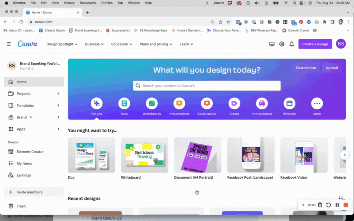
Canva is perfect for business owners who want to stay hands-on. You can create branded templates, set your fonts and colors, and keep everything looking consistent — without needing a full-time designer.
Why it works:
Pricing: Free plan available; Pro starts at $14.99/month

Adobe Illustrator is the industry standard for precise vector graphics. Great for detailed logos, icons, and brand marks that need to scale cleanly.
Why it works:
Pricing: $22.99/month (standalone)
For defining tone and collecting inspiration
Pinterest is a fast and visual-first way to collect references, aesthetics, and emotional tones for your visual direction.
Why it works:
Pricing: Free

Milanote can build structured mood boards with notes, links, and comments. Excellent for aligning your team on tone and direction.
Why it works:
Pricing: Free with limited cards; Pro starts at $9.99/month

For documenting and sharing your visual identity
With Notion, you can keep branding aligned across teams with editable docs, embedded visuals, and real-world examples.
Why it works:
Pricing: Free personal plan; Pro starts at $10/month per user
With Canva Brand Kit, you can upload brand assets once and apply them across all content. Perfect for social templates, pitch decks, and quick marketing updates.
Why it works:
Pricing: Brand Kit is part of Canva Pro ($14.99/month)
With Figma templates, you can create reusable templates that help internal teams stay visually consistent as the brand grows.
Why it works:
Pricing: Free; part of any Figma plan

To help you compare these tools at a glance, here's a quick overview of their strengths and pricing:

Once you’ve got the right tools in place, you’re ready to start building. But what if you’re stuck at square one — no designer, budget, or clear vision yet? That’s where AI can give you a boost.
AI can’t replace a designer’s insight — but it can offer a powerful head start, especially when working on visual identity in graphic design, where direction and speed matter.
Whether you're brainstorming a logo, exploring color palettes, or testing typography pairings, today’s AI tools can generate dozens of directions in minutes. For small businesses or solo founders, that kind of speed can be a game-changer.
Here’s what AI can help with and where it shines:
Tools: Looka, Brandmark
These tools generate logos based on simple inputs like your business name, industry, and style preferences.
Why it works:
Best for: Early-stage brands needing fast options without hiring a designer upfront.

Tools: Khroma, ColorMind
These AI tools generate on-brand color schemes based on mood, visual examples, or your preferences.
Why it works:
Can create contrast-optimized sets for UI or print

Tools: Midjourney, DALL·E, Sora
Need to define an illustration style or brand mood? Use AI image generators to visualize potential directions.
Why it works:
For example, With Sora, you can create branded visuals, like this retro Volvo ad, generated from a simple prompt: “Vintage 1980s Volvo poster… photorealistic golden Volvo 244 racing a silver Porsche 911… nostalgic film vibe with motion blur and light trails.” It’s a fast way to explore brand aesthetics and storytelling without a production team, letting you test visual directions and craft memorable campaigns from text alone.

Tools: Fontjoy, Typ.io
Struggling to match fonts that express your brand tone? These tools suggest combinations based on visual contrast and emotional fit.
Why it works:
Helps avoid clashes or awkward spacing issues

If your brand is in its early stages and you don’t have a full creative team or defined brand strategy, AI tools can be a great way to explore options quickly. Think of it as visual sketching, not the final design, but a way to test, tweak, and iterate.
Pro tip: The best results come when you combine AI’s speed with human judgment. Use these tools to spark ideas, then refine the final direction through your own design process or with the help of a creative partner.
Visual identity isn’t just about making things look nice, it’s about making your brand feel real.
Throughout this guide, we unpacked what a strong visual identity really is, why it matters, and how to build one, even if you don’t have a formal brand strategy.
Key takeaways
Feel like you won’t cope alone with the brand visual identity or the overall design of your project? Here is how to hire a graphic designer, outsourcing solutions, and tips on what to pick for graphic design outsourcing.


