Marketing design
15
min read
Fonts aren’t just design. They’re perception.
Look at PlayStation and NASA. Two wildly different brands — one about gaming and fun, the other about space exploration and science. Yet, before you even think about what they do, their typography already tells a story.

Toys“R”Us uses colorful, bouncy letters to radiate fun and childhood joy. TIME pairs bold red serifs with sharp spacing to project authority and tradition. Two fonts, two moods — pure font psychology.
Studies show that fonts are more than just aesthetic choices. For example, a study titled "The Perception of Qualities in Typefaces" demonstrates that selecting the right font for your brand can increase product sales, enhance trustworthiness, and encourage users to spend more time exploring your site.
Fonts shape perception, whether we realize it or not. That’s why, at Today Made, we don’t just pick fonts — we design with purpose, whether for branding or web experiences.
To help you navigate the world of font choices, this guide will cover:
To better understand why fonts and their meanings matter, let’s take a closer look at font psychology and how it influences our perceptions.
Font psychology is the study of how different fonts evoke psychological and emotional responses. It explores how fonts can shape our perceptions, influence how we feel about a message, and even guide our decision-making.
Psychology of fonts is not just about choosing a pretty typeface — it’s about understanding how typefaces, aka font families, impact emotions and how they can convey meaning without a single word being spoken.
Fonts are more than just letters — they trigger subconscious associations based on their shape, weight, and historical use. When you see a font, your brain automatically interprets it in a specific way, influenced by these factors.
For example, take a look at the image below.

Do these fonts seem familiar to you?

I bet your brain made connections to at least one of the pictures. That’s because every typeface carries subconscious associations. Here’re more examples for you:


These are not just some guesses; there’s strong evidence that fonts influence how we perceive information. A study published in PubMed Central found that serif fonts enhance reading speed and comprehension in print, likely due to their guiding serifs. Meanwhile, sans-serif fonts (like Arial) are better suited for digital screens, as they reduce cognitive load and improve readability online.
Take Webflow as an example. They use “WF Visual Sans”, Arial (one of sans-serif fonts) for their digital product. This makes it easier to process information about their low-code tool, which might otherwise feel complex, while also giving their brand a clean and trustworthy look.

With a clear understanding of how fonts influence perception, let’s dive into the psychology of typefaces and explore how they can affect emotions, behavior, and brand identity.
Imagine reading a wedding invitation in a sleek, corporate sans-serif font. It would feel cold and impersonal, right? Now, picture a law firm’s website using a playful, handwritten script. It wouldn’t exactly inspire confidence.
That’s because fonts trigger emotions just as much as colors, images, and words do. A single typeface choice can make something feel serious, fun, elegant, or even aggressive. But why?
Let’s break down how different types of fonts trigger specific emotional responses:

Originating from ancient Roman typography, serif fonts have a long history in the Latin alphabet and have been used for centuries. This historical connection gives them a "classic" feel, often associated with tradition.

That’s the reason Serif fonts like Times New Roman and Garamond are tied to tradition and reliability, and are viewed as more conservative. Their formal, structured feel makes them perfect for professional settings like legal documents and print media. They convey authority and respectability, making them ideal for brands wanting to appear established and trustworthy.
When it comes to websites, take A List Apart as an example.

This design and web development magazine uses Georgia, a classic serif font, to maintain readability while conveying a sense of professionalism and sophistication in its content.

Sans-serif fonts like Helvetica and Futura are known for their simplicity and clarity.
First developed in the early 1800s, they gained popularity with the modernist movement, which emphasized purity of form. Their association with innovation and the rise of digital media, where they perform better than serifs, cemented their modern reputation.
Without the "serifs" at the end of the strokes, they feel cleaner and more trend-forward. Digital designers particularly favor these fonts for their readability and efficient, user-friendly design. Helvetica, for example, is often used by tech companies to convey professionalism and contemporary appeal.
An example of this in action is TodayMade's website design for Refera dentist referral solution. To ensure the design was approachable and clean, we selected Inter font. Its modern, simple style matched the tone of the website, emphasizing ease of use and clear communication, which is essential in medical design.


Script fonts like Lobster and Zapfino mimic handwriting, evoking elegance and personal connection. They are ideal for conveying creativity and luxury but it’s better to use them sparingly, as they can be difficult to read in longer text blocks.
For example, Auto Classic Garage uses the Lobster script font in some places on their website to evoke a retro feel that aligns with their focus on classic vehicles. The font adds a nostalgic, vintage touch, while maintaining readability and professionalism.


Display fonts like Impact and Bebas Neue are designed to stand out. They are dynamic and often used for headlines, ads, and logos. These fonts are perfect for making a strong visual impact, but they can overwhelm the content if overused.
Take Netflix, for example. The streaming giant’s logo uses Bebas Neue to create a clean yet bold impression, perfectly capturing the modern, accessible feel of the brand.

Its bold and simple design ensures that Netflix’s logo stands out in a crowded marketplace while maintaining clarity and recognition.
Now, let’s take a closer look at how these emotional impacts are reflected in a comparison table:

As we've seen, fonts can evoke strong emotional responses, but these feelings are not universal. Fonts are interpreted differently depending on cultural context. As one Reddit user pointed out:

This leads us to the next point: understanding how these responses can change based on cultural differences, as what works in one part of the world may not have the same effect elsewhere.
Fonts don’t mean the same thing everywhere.
A bold, red typeface might signal urgency in the U.S., but in China, red often symbolizes luck and celebration. A serif font might feel classic and prestigious in Europe, but in Japan, it could seem outdated and overly formal. Typography psychology isn’t just about aesthetics — it’s deeply tied to cultural perception.
While certain font trends dominate globally, their meanings can shift dramatically depending on the audience.
Let’s break down some key differences in how cultures perceive type:

For example, in Japanese design, minimal sans-serif fonts dominate modern branding, reflecting a preference for clean, simple aesthetics. Meanwhile, Arabic and Indian typography often embraces calligraphic styles, as fluid letterforms are historically significant in their writing systems.
To appeal to different cultures, global brands often adjust their fonts when marketing in different regions. For example, McDonald's Japan uses softer, rounder fonts compared to the U.S. version, making the brand feel more friendly and approachable.

So, if you’re designing for a global audience, ignoring typography’s cultural context can lead to miscommunication, loss of trust, or even brand failure. Before finalizing a font choice, ask:
However, it's important to note that everything we talk about typeface psychology here — how different fonts evoke emotions or vary across cultures — is not a universal truth but more of a helpful guideline. As one Reddit user rightly put it,
“Hopefully nobody takes this as objectively true but more as a starting point. In the right context, each of these fonts can convey any of the emotions, feelings, or associations shown here.”
Beyond emotions, there are other factors to consider when choosing the right font for your brand. Let’s talk about them.
When choosing fonts, two key factors come into play:
These two goals often pull in different directions. Fonts that are clean and simple support quick comprehension, while fonts with more visual complexity can make a lasting impression but may slow down reading.
So how do you find the right balance?
Interestingly, research shows that fonts that are slightly harder to read can actually improve memory retention. This is known as the disfluency effect — when the brain encounters a challenge, it pays more attention and processes the content more deeply.
Mentioned above, a 2012 study by Diemand-Yauman et al. found that participants who read material in more complex fonts, like Monotype Corsiva, remembered the content better than those who read the same material in a simple font. That extra bit of cognitive effort led to deeper engagement with the text.
Take a look at these two images: the first one is clear, simple, and easy to read at a glance. The second requires more effort to process, making it less immediately accessible.

But here’s the catch: too much complexity, and you risk losing clarity. Fancy or decorative fonts might look cool, but they can be hard on the eyes, especially in long paragraphs. A little complexity can help with memory in things like slogans, but when you want your message to be clear and easy to read, simplicity is key.
That’s why always guide font selection by context and purpose. Are you writing an article, designing a logo, or crafting a landing page? Each case calls for a different balance between clarity and character.
Let’s break down how different font families support different goals from long-form readability to striking, memorable design.
Low contrast and open shapes make it ideal for large blocks of body text. It feels classic and readable.

This is the most neutral text style with semi-closed forms and balanced contrast — a versatile go-to.

Because of high-contrast these crisp and elegant fornts are great choice for long blocks of text, like books or articles.

With minimal contrast and bold serifs, slab fonts are structured and strong, so they are often used on signboards and ads.

These early sans-serifs are known for their uneven, quirky forms.

With tightly closed letterforms, they’re not very comfortable to read in continuous text, so they suit best for brief inscriptions or captions.

Stylish and minimalist, geometric fonts are visually striking, but are less suitable for large paragraphs.

With open letterforms and natural proportions, they feel warm and approachable, making them ideal for long-form reading and accessibility-focused design.

All of these styles help you balance readability and memorability based on your format and goal, but there’s one more layer to consider: accessibility.
Readability isn’t just about design — it’s about ensuring everyone can read your content, including people with dyslexia, visual impairments, or cognitive challenges.
Here’s what to keep in mind:
Despite this, some people think that overly stylized fonts come with unexpected benefits — like this take from Reddit on Comic Sans:
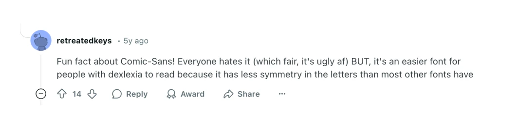

A readable font improves experience. An accessible one opens the door to everyone. And that’s good design.
Now that we've explored the theory behind font psychology, let’s move on to practical tips for choosing the right font for your design.
Choosing the right font is more than just picking something that looks good. Our UI lead, Darina Silchenko, an experienced typography expert and instructor, shares her approach to selecting the perfect typeface:
Before choosing a font, think about your brand’s core values and identity. Do you want to appear serious and professional or creative and playful? Fonts can communicate these qualities instantly.
As our lead designer, Darina Silchenko, points out, "There is a typography trend towards complexity in the design world right now, particularly in web design. While minimalism has been the dominant style for some time, we're now seeing a shift towards more customized, variable fonts."

The image above showcases several trending websites, where you can see this design shift in action. The typography used in these sites is far from standard — each font is carefully chosen or custom-designed to make a bold statement.
When selecting fonts, always start by asking: Who is this for?
Font choice should reflect the age of your audience, their industry, interests, and the emotions you want to evoke.
Here’s how to break it down:
Younger users respond to modern, digital-native fonts like Satoshi or Plus Jakarta Sans; older audiences may prefer classic, structured serifs like Georgia or Garamond.
Typography preferences vary across cultures. What’s considered clean and modern in the West might feel cold or impersonal in other regions. Always consider localization if your design is global.
A luxury skincare brand and a fitness app might both target 30-somethings, but their tone is wildly different. The skincare brand might lean on elegant, high-contrast serif fonts; the fitness app may go for bold, geometric sans-serifs.
To sum up, effective font selection means matching font personality with audience mindset. Think beyond demographics and into how your audience feels when they interact with your design.
When selecting fonts for body text, readability should always come first, particularly for longer reading experiences like blogs, articles, or reports. Your audience will quickly lose interest if the text is hard to read.
The same goes for interface fonts—they should also prioritize clarity. According to our designer Darina, some of the most popular options today include:
Take Inter, for example. This widely-used sans-serif font features a large x-height, optimizing legibility across digital platforms. It’s one of Today Made’s favorites for a reason!
When choosing fonts, consider where they’ll be used. A font that works well in print might not be as effective on a digital screen.
Remember the section on readability vs. memorability we covered earlier? It has plenty of insights on choosing the right font for different mediums — feel free to revisit it anytime.
To keep it short, the type of project should guide your font choice. Whether you’re designing a website, logo, brochure, book, poster, or animation, different mediums require different fonts.
One font alone can’t always do the job. Pairing fonts effectively adds contrast and visual interest, but they should always complement each other.
Here are the key rules from Darina:

To make font pairing easier, Darina also shared a few go-to resources that can guide you through the process:
Finally, test the fonts in real-world situations before committing to them. A/B testing can give you valuable insights into which fonts perform best with your audience, both in terms of engagement and clarity.
Mastering typography takes time — and that’s perfectly fine. Now that we’ve explored both the font theory and practical strategies, let’s bring it all together.
As we wrap up, it’s important to remember that mastering typography is a gradual process. Whether you’ve been learning the theory or applying practical tips, it’s perfectly normal to face challenges along the way. Typography is both an art and a science, and like any skill, it requires practice, patience, and continuous learning.
For beginners, struggling with typography is part of the journey. Here’s why:
Remember, even professionals refine their typography skills over years. Don’t be discouraged by early setbacks. Keep practicing, keep experimenting, and your typography will improve over time.
Feel like you won’t cope alone with the typography and overall design of your project? Here is how to hire a graphic designer, outsourcing solutions, and tips on what to pick for graphic design outsourcing.


