How to Combine Fonts: A-Z Guide for Beginners


The fonts you choose – and how you combine them – have the power to enhance or undermine your entire project. Whether you're creating a website, a presentation, or marketing materials, the right font combinations are necessary to create great graphic design.
Using multiple font styles in one design is an art and a science. It requires understanding font anatomy, grasping key design principles, and avoiding pitfalls that can lead to cluttered or confusing visuals. In this guide, we’ll walk you through everything you need to know to confidently combine fonts like a pro.
Let’s dive in and discover how to pair fonts like a pro!

Good typography does more than make text legible – it sets the tone, communicates your brand identity, and guides the viewer’s attention. Combining fonts strategically helps you achieve several design goals:
By mastering the art of font pairing, you can create designs that not only look stunning but also communicate your message with clarity and impact.

Before diving into font pairing, it’s essential to understand the basic font categories and their anatomy. This knowledge forms the foundation for combining fonts effectively.

Characterized by small lines or embellishments (serifs) at the ends of letters, serif fonts exude a sense of tradition and formality. They are ideal for body text in print materials.
Examples: Times New Roman, Garamond, Georgia.

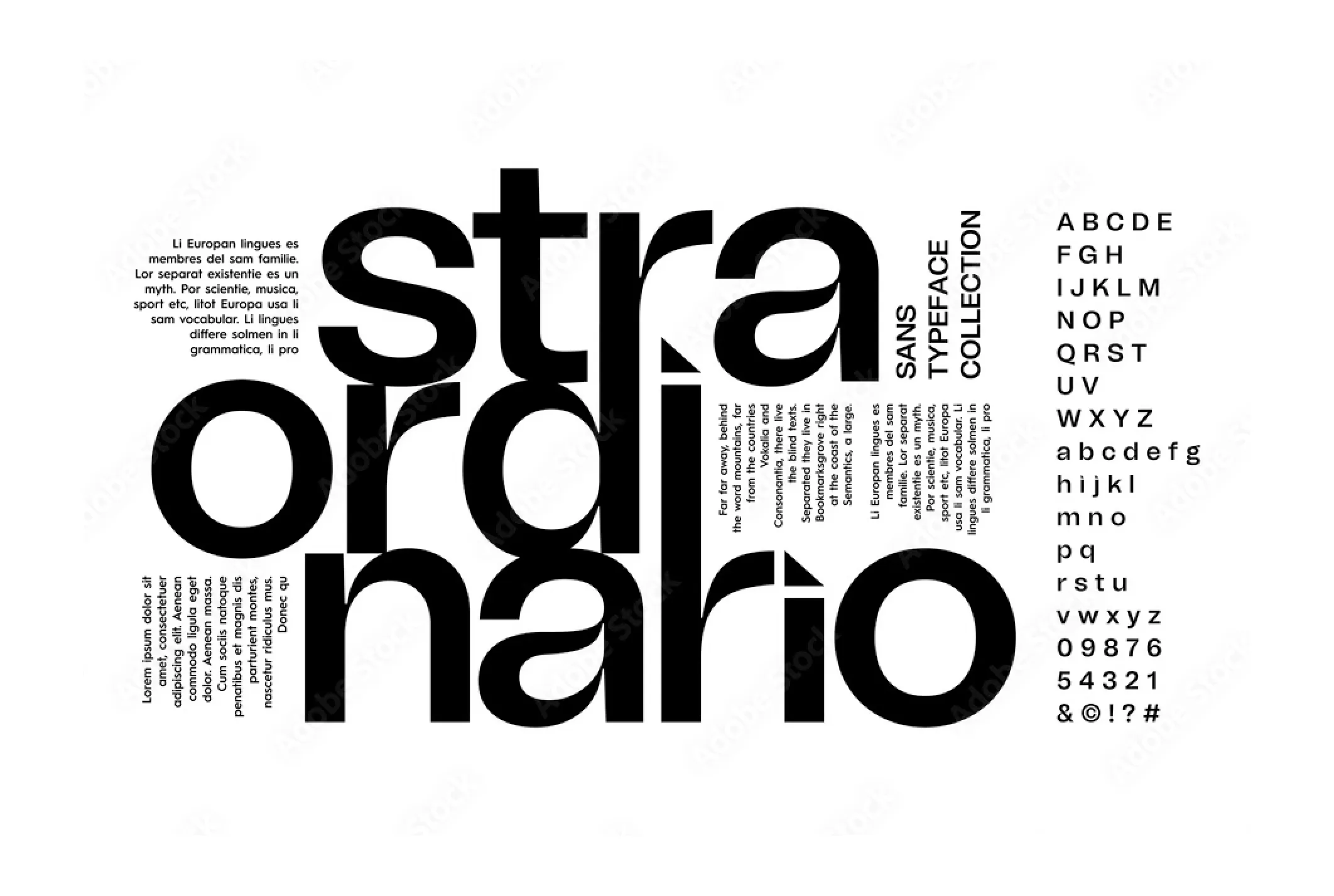
Sans-serif fonts lack the decorative elements of serif fonts, offering a clean and modern look. They are widely used for digital applications and minimalistic designs.
Examples: Arial, Helvetica, Open Sans.

Mimicking handwritten or cursive writing, script fonts add elegance or a casual vibe depending on their style. They should be used sparingly for headers or special accents.
Examples: Brush Script, Pacifico, Great Vibes.

Designed for headlines and attention-grabbing elements, display fonts are often bold, decorative, or unique. They should be used judiciously to avoid overwhelming the design.
Examples: Lobster, Impact, Cooper Black.

Each character in monospaced fonts occupies the same amount of space, giving a retro or technical feel. These fonts are often used in coding or data-heavy designs.
Examples: Courier, Consolas, Monaco.

Every font is constructed from specific elements, and understanding these can help you pair fonts effectively:
By recognizing these features, you can identify fonts that either harmonize or contrast effectively, laying the groundwork for successful combinations.
So, how to pair fonts together effectively? There are some common rules that can guide you.

You can and often should use multiple fonts in one design – but the golden rule of typography is to keep your design limited to three fonts or fewer. Too many fonts can create visual chaos and detract from your message. Assign clear roles to each font:
Limiting yourself to three fonts ensures a clean and professional design that is easy to navigate.

Combining fonts with complementary characteristics creates harmony in your design. Complementarity doesn’t mean similarity – it’s about finding fonts that balance and enhance one another.
The goal is to balance contrast and cohesion, creating a pairing that feels natural.
Contrast is the secret ingredient for creating visual interest. Without it, your design might feel flat or monotonous. Here’s how to use contrast effectively:
However, contrast must be intentional. Too much variation can make your design look disjointed.
Typography hierarchy is the roadmap that guides your reader through the content. When applied effectively, it ensures that the most important elements stand out.
By aligning font hierarchy with your design goals, you can direct the viewer’s attention exactly where it’s needed.
At the core of every great design is readability. While fonts can be stylish and eye-catching, they should never detract from the message. Keep these tips in mind:
When readability and aesthetics work hand-in-hand, your design becomes both beautiful and functional.
Combining fonts can elevate your design – but when done poorly, it can create confusion and detract from your message. Here are common pitfalls to avoid and how to steer clear of them when you think about how to combine fonts.
Using more than three fonts in a single design can make it look cluttered and chaotic. Excessive variety creates competition for attention, diluting the overall impact.
Pairing fonts with vastly different tones or styles can make your design feel disjointed. For example, combining an ultra-modern sans-serif with an ornate script font can clash visually.
While it’s tempting to prioritize aesthetics, readability must always come first. Overly decorative fonts or fonts with tight spacing can make text difficult to read.
Fonts that look too alike can make your design appear monotonous and fail to create a visual hierarchy. For example, pairing two sans-serif fonts with only subtle differences in weight or size can feel redundant.
A font pairing that looks great on a desktop screen might not translate well to print or smaller mobile devices. Failing to account for the context of your design can result in poor usability.
Decorative fonts can add character but should never dominate your design. Overusing them, especially in body text, can make your design feel unprofessional.
Fonts that seem like a perfect match in theory may not work well in your actual design. Rushing font selection without testing can lead to unexpected issues.
Seeing successful font pairings in action can inspire and guide your own designs. Below are practical examples of font combinations, along with their use cases and characteristics.

Why it works: This pairing balances elegance and modernity. Playfair Display, a serif font with classic charm, contrasts beautifully with the clean and approachable sans-serif Source Sans Pro.
Use case: High-end brand websites, editorial layouts, or fashion blogs.

Why it works: Montserrat, a geometric sans-serif, exudes a contemporary feel, while Merriweather’s serif style ensures readability in longer texts. Together, they create a sophisticated yet versatile aesthetic.
Use case: Corporate websites, SaaS platforms, or technology blogs.

Why it works: Bebas Neue is a bold, all-caps display font that demands attention, while Open Sans provides clarity and subtlety for body text. The combination ensures visual hierarchy without overwhelming the viewer.
Use case: Posters, landing pages, or promotional materials.

Why it works: Raleway’s sleek and slightly decorative sans-serif style pairs effortlessly with Roboto’s neutral and highly readable structure. This pairing achieves balance and flexibility.
Use case: Portfolios, agency websites, or modern blogs.

Why it works: Oswald, a condensed sans-serif font, is perfect for bold headlines, while Lora’s serif elegance makes body text feel inviting and easy to read. The pairing is dynamic yet harmonious.
Use case: Blogs, storytelling websites, or editorial content.

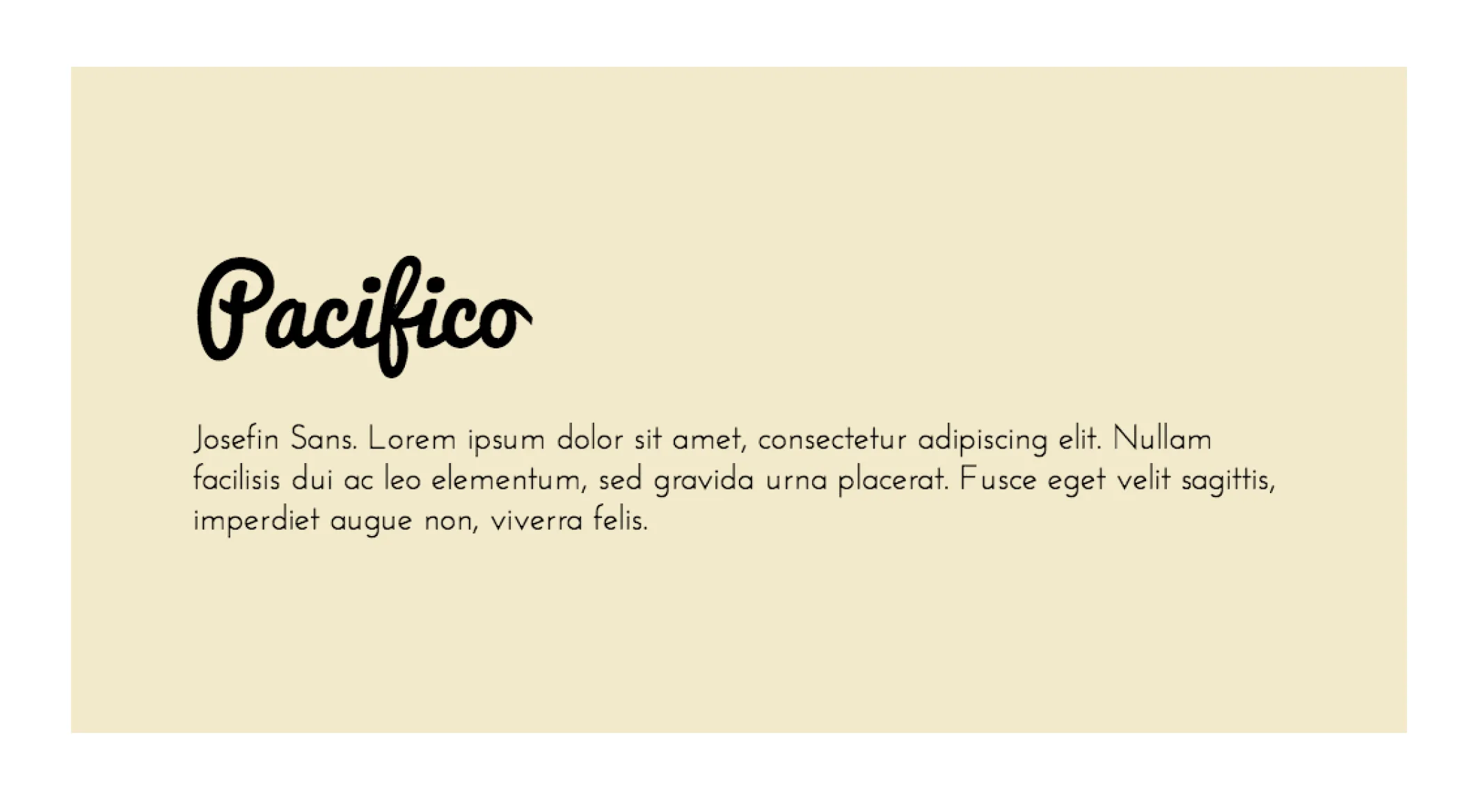
Why it works: Pacifico’s handwritten script adds personality and charm, while Josefin Sans keeps the design grounded with its clean simplicity.
Use case: Event invitations, café menus, or playful branding.

Why it works: This classic combination pairs the traditional serif Times New Roman with the highly versatile sans-serif Arial. Though simple, it remains effective for professional and academic designs.
Use case: Reports, academic presentations, or formal documents.

Why it works: Futura’s geometric precision contrasts with Garamond’s timeless and literary charm, making it a unique pairing for creative projects.
Use case: Magazines, book covers, or artistic portfolios.
Creating stunning font combinations is easier when you have the right tools and resources at your fingertips. From online platforms to expert references, these tools can help streamline the process of combining fonts and inspire creativity.

These interactive tools allow you to experiment with font pairings and visualize how they will look in your design:
A free library with hundreds of fonts, Google Fonts also provides pairing suggestions for each typeface.
Best for: Web designs, as the fonts are optimized for digital use.
Website: fonts.google.com
Fontjoy uses machine learning to suggest complementary font pairings. You can adjust the contrast level between fonts for tailored results.
Best for: Generating ideas for high-contrast font combinations.
Website: fontjoy.com
Typewolf showcases real-world examples of font pairings and provides recommendations for popular typefaces.
Best for: Finding creative inspiration and exploring lesser-known fonts.
Website: typewolf.com
Canva’s built-in tool suggests font combinations within its design platform. It’s perfect for non-designers looking for quick solutions.
Best for: Beginners working on social media posts, presentations, or lightweight projects.
Website: canva.com
Specially designed for pairing Google Fonts, this tool categorizes combinations by use case, like headings and body text.
Best for: Designers using Google Fonts for websites or presentations.
Website: fontpair.co

Managing fonts efficiently can save you time and help you maintain consistency in your projects.
Offers a wide selection of professional fonts, easily integrated into Adobe Creative Cloud tools.
Best for: Professional designers using Adobe software for complex projects.
Website: fonts.adobe.com
A lightweight font manager that allows you to preview and organize fonts, including Google Fonts, on your computer.
Best for: Designers juggling multiple projects and font libraries.
Website: rightfontapp.com

Deepening your knowledge of typography can refine your font pairing skills. Here are some expert-recommended resources:
Typography is the unsung hero of design. The way you combine fonts can significantly influence how your message is perceived, whether you’re designing a website, creating marketing materials, or crafting a brand identity. With the right font pairings, you can captivate your audience, enhance readability, and effectively communicate your story.
At TodayMade, we specialize in bringing the art and science of typography to life, ensuring that your project achieves its goals with precision and creativity. Get in touch with us today and get a professional marketing designer to bring your visual materials to new life!


