Business tips
17
min read
Tired of your website just sitting there? This guide shows you how to build a lead generation website in 2025 with smart strategies, proven design tips, and real examples that turn clicks into paying customers. If you're serious about growth, start here.
Imagine walking into a store where no one greets you, there’s no sign of where to go, and you’re left wandering aimlessly. Frustrating, right? That's how your potential clients feel when they land on a poorly designed website that doesn't guide them through the buying process.
Here’s the thing: businesses with well-optimized lead generation websites see up to 53% more conversions than those without. Yet, many companies still struggle to get it right.
At TodayMade, we’ve found the magic lies in blending strong visual designs, high-quality content, and marketing tools that work. Our insights have helped clients achieve great results and drive traffic; now, we’re sharing them with you. Let’s dive in!
Your website can do more than look good. It should actively attract visitors, engage them, and convert their interest into actionable leads. If it’s not driving growth, it’s not doing its job.
So, what makes a lead generation website so essential? Let’s start with the basics and find out.
A lead generating website is a purpose-built tool designed to capture and nurture interest, ultimately converting visitors into potential customers. Think of it as a salesperson who works tirelessly 24/7, guiding users toward specific actions, such as signing up for a newsletter, scheduling a demo, or downloading an eBook.
For instance, a SaaS company might use its website to collect email addresses through a free trial offer. At the same time, a local real estate agency might focus on generating inquiries about listings. While the industries may differ, the goal remains the same: turning clicks into actionable leads.
To appreciate their value, let’s explore how lead-generation websites drive business growth and attract customers.
Companies with optimized lead generation websites consistently see better results. Clear CTAs, fast load times, and tailored, relevant content don’t just user attention, they convert it into action. When supported by strong website design for SEO, these pages perform even better, ranking higher and reaching audiences organically. Pair that with optimized website speed metrics and a focus on modern web design, and you get a high-performing digital asset that not only looks great but drives measurable business growth.
Recent statistics show that businesses with effective lead-generation strategies generate 50% more qualified leads while spending 33% less on customer acquisition.
When innovative design meets a deep understanding of your audience, your website transforms from just another digital space into a powerful growth engine. Yet, many businesses miss this opportunity because they don’t truly understand their ideal customer profile (ICP). Instead, they attract the wrong audience, pouring time and resources into leads that never convert.
It’s a common frustration echoed in community discussions. One Reddit user said, "To focus your efforts, it really helps to start with one ideal client profile, map out their likely business problems in detail, and build your content to speak to these problems and how you can solve them."
This highlights the importance of knowing your audience and tailoring your website to address their specific needs. The solution is straightforward but often overlooked: get clear on who your audience is and what they’re looking for. Then, build your website with their journey in mind.
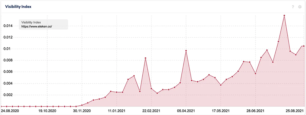
Let’s take Eleken as an example. Not long ago, the company gave their site a major makeover to better align with their ICP. The result? A serious boost in conversion rates.
Here’s how it happened:
Now that we understand why lead generation websites are essential, you can learn even more with the website owner's manual. And then, let’s explore the must-have features that make them truly effective and how to implement these elements to maximize conversions.
A high-converting lead generation website is carefully crafted and not left to luck. Every element has a purpose: to attract, engage, and convert visitors. Here’s what it takes.
People judge your website in seconds. A cluttered or outdated design? That’s a fast track to “no thanks.” On the other hand, a clean, user-friendly layout immediately says, “We’re professional, and we value your time.” Visitors shouldn’t have to guess where to click or struggle to find what they need. The design should guide them effortlessly.
But even great layouts can be undone by a common misstep: stock photos. Sure, they’re easy, but they often feel generic and disconnected. High-quality illustrations and custom visuals like well-crafted graphics or authentic team photos build trust and make your brand memorable.
Think about it: would you trust a website using a blurry stock image of random handshakes or one showcasing crisp, relatable visuals of a team doing the work? The difference is night and day.
Here’s a simple example: one website uses a grainy, overused photo of generic businesspeople, while another shows a vibrant, authentic shot of their real team at work. Which one earns your trust? It’s obvious. Small details like this can make a significant impact.

Call-to-actions (CTAs) are where curiosity meets conversion. A clear, compelling CTA, like “Get Your Free Guide,” gives visitors an obvious next step. But here’s the catch: placement is everything. If your CTA is buried at the bottom of a page or hidden in a wall of text, it will be ignored. Smart strategies like putting CTAs above the fold, using sticky buttons, or adding exit-intent popups keep them front and center where they belong.
Language matters, too. Think of CTAs as a friendly nudge, saying, “Here’s your next step.” Phrases like “Get started today” or “Claim your free guide” are clear, action-oriented, and effective. And if your CTA isn’t delivering results? Experiment. Testing small changes, like tweaking the wording or switching up the button color, can have a surprisingly big impact. For example, Dropbox keeps it simple and direct with its CTA: “Sign up free.” It’s straightforward, effective, and hard to miss.

HubSpot’s homepage is another excellent example of CTA mastery. It grabs attention with clear messages and a prominent CTA: “ Get a demo” and “Get started free.” There’s no clutter, no unnecessary distractions, just a focused path to action. Pairing this with valuable resources, like templates and guides, allows HubSpot to capture leads and position itself as a go-to resource.

When it comes to CTAs, there are a few golden rules:
Speed and mobile responsiveness are deal-breakers. Over 54% of web traffic now comes from mobile devices, and Google uses site speed as a ranking factor. A slow, clunky website isn’t just frustrating; it actively hurts conversions and SEO.
Visitors don’t wait for slow-loading sites. They hit the back button. Mobile users, especially, expect smooth, seamless navigation. If your site isn’t optimized for smaller screens, you lose leads before they engage. Yet, many businesses still overlook mobile-first design, leading to high bounce rates and missed opportunities.
A streamlined, mobile-first approach ensures your site performs well for everyone, regardless of device. Think of fast load times, clean layouts, and responsive design that adjusts perfectly to any screen size.
The good news? There are tools to help. Google’s PageSpeed Insights is great for analyzing load times and suggesting fixes. Optimize your images, enable caching, and reduce unnecessary scripts to boost performance. Google’s Chrome Lighthouse is a quick and easy way to spot issues in mobile responsiveness.

The average landing page conversion rate hovers around 2.35%. But aiming for the top 10%? That’s where the real challenge and opportunity lies.
High-performing websites don’t send all traffic to a generic homepage. Instead, they create pages tailored to specific user intents or ad campaigns. For example, a home-service business might design a landing page specifically for “Roofing Services in Miami” to match search queries or ad copy. This strategy directly addresses the visitor's wants, making it far more likely to convert them into leads.
Professionals often highlight the power of targeted landing pages in industry discussions, like those on Reddit. As one user explained, “Our #1 way for generating leads is targeted SEM campaigns that are hyper-localized, with super-specific landing pages to the keywords we target. The idea is to match user intent perfectly.”
Imagine a potential high quality propspect searching for “Roofing and Solar Solutions in DFW.” Now, picture them landing on a page that speaks directly to that need with localized content, clear CTAs, and trust-building elements. That’s the kind of experience that drives results: Webflow featured this localized website in its lead generation showcase, as shown in the below example.

Yet, many businesses fail to use this strategy effectively. Instead, they direct all traffic to generic homepages, missing the chance to create a meaningful connection with visitors.
Capturing leads is just the start. Tracking and nurturing them is where actual results happen. Without these systems, even the most well-designed website can struggle to deliver long-term value.
Tools like HubSpot and Salesforce are industry leaders for a reason. They help businesses manage leads efficiently, track interactions, and automate follow-ups. For example, HubSpot’s CRM offers features like email tracking, lead scoring, and workflows that allow you to send targeted messages based on a user’s behavior.
On the other hand, Salesforce excels at scaling these processes for larger teams, offering detailed reporting and integrations with countless other tools. Whether you’re a small business or a growing enterprise, these platforms ensure no lead gets left behind.
For small businesses, integration is even more critical. Community insights often highlight frustrations with disorganized lead-tracking processes, which lead to lost opportunities. A CRM system integrated with marketing tools streamlines these workflows, reducing manual effort and improving follow-up rates. For instance, pairing your website forms with automated email sequences ensures that leads receive timely responses, even outside business hours.
User testing is one of the most overlooked tools in website optimization. You can wireframe and A/B test all you want, but if you’re not getting feedback from real users, you’re basically throwing darts in the dark, with your eyes closed.
Here’s a striking stat: industry-wide data shows landing pages average a modest 4.3% conversion rate. That means for every 100 visitors, 95 of them are walking out the door. Want to do better? Get obsessed with what’s not working.
User testing doesn’t have to be complicated or expensive. Start small:
Want proof this works? HubSpot conducted A/B tests where they removed links to demos from landing pages, resulting in a 28% increase in conversion rates. Not because they redesigned the page. But because they removed a distraction that pulled users away from the core CTA.
Many businesses, despite their best intentions, fall into these common traps that hurt their site’s effectiveness and leave potential leads disengaged:
Generic templates might seem quick and cost-effective, but they often fail to connect with your audience. Instead of building trust, they make your brand look impersonal or untrustworthy. Users frequently voice frustrations about templates that feel “cheap” and fail to reflect the business’s unique identity. As one Reddit user put it, "Pronto is just OK. They pump out canned websites like it's their only business."
The problem with generic designs is that they don’t communicate what makes your business special. Your website is often the first impression visitors have. Potential customers will likely move on to a competitor offering a more engaging experience if it feels bland or uninspired.
The solution? Invest in a custom, purpose-built design. A tailored website ensures your business stands out and resonates with your audience. For example, an independent bakery might create a site with unique branding, signature colors, authentic photos of fresh bakes, and even customer testimonials. Contrast that with a generic template with images of bread. It’s obvious which one feels more trustworthy and inviting.

Low-quality images are a silent killer for many websites. Visitors form snap judgments within seconds, and poor visuals can instantly erode trust. Think of the last time you saw a blurry or overused stock photo. Did it inspire confidence? Probably not. This issue, often called “stock photo fatigue,” is a common frustration among users who encounter the same lifeless images across countless websites.
High-quality visuals, on the other hand, can elevate your website from forgettable to unforgettable. Custom photography, tailored graphics, or authentic images of your team can create an emotional connection that stock photos simply can’t replicate. For example, a local yoga studio showcasing real photos of their instructors and classes feels far more inviting than a site plastered with generic pictures of models striking poses in sterile environments.
Hiring a graphic designer can take your visuals to the next level. They can create custom graphics, infographics, or even stylized product shots that align perfectly with your brand. A designer's expertise ensures your website has cohesive, professional-looking imagery that grabs attention and keeps visitors engaged, guiding their focus, highlighting key content, and reinforcing your brand’s identity.
Visuals are also crucial in SEO. Compressed, properly tagged images can improve site speed and boost search rankings. Tools like TinyPNG can help optimize image files without sacrificing quality, ensuring your site remains fast and user-friendly.
Cluttered designs, conflicting visuals, or complex navigation can frustrate and drive users away. This often happens when businesses try to cram too much onto a page or fail to understand their users’ journeys.
Simplification is the key. Each page should have a singular focus, encouraging users to download a resource, complete a form, or book a call. A clean, purposeful layout reduces distractions and helps visitors engage more effectively.
For example, Airbnb’s website prioritizes its search bar as the primary action, allowing users to find accommodations quickly and without confusion.

When designing your website, think about how visitors interact with it. What’s the first thing they notice? What actions are you guiding them toward? If there are too many competing elements like multiple CTAs, flashy graphics, or irrelevant content, users can feel overwhelmed and leave without taking action.
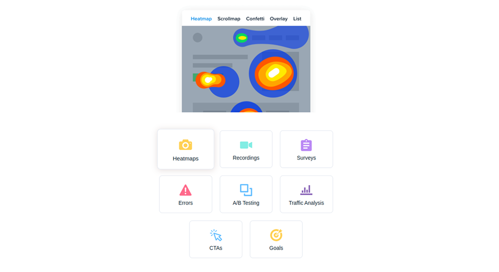
White space is another powerful tool. It’s not about leaving empty areas but giving content room to breathe, enhancing readability and focus. Tools like heatmaps (e.g., Crazy Egg) can provide valuable insights into how users navigate your site, highlighting where they click or get stuck.
Finally, we have forms, the unsung heroes of lead generation. Unfortunately, they’re often designed as afterthoughts, with unnecessary fields, poor placement, or complex formatting that frustrates users.
To avoid this, keep forms simple and focused. Ask only for the essentials: name, email, and one or two key pieces of information. If you need more details, consider using multi-step forms, which feel less intimidating and are proven to boost completion rates.
Consider this: landing page sign-up forms have an average conversion rate of 23%. Yet, only 5% of businesses use them effectively. By contrast, ubiquitous and often annoying popups have an average conversion rate of just 3%. The takeaway? Use clear, well-placed forms on focused landing pages. For example, Medium integrates a simple, visible sign-up form on its homepage that complements its CTA, making the path to action effortless for visitors.

Upon clicking the "Get Started" button, users are presented with a straightforward registration form. The form's headline is clear and direct: "Join Medium." The layout is minimalistic, focusing solely on essential information. This design eliminates distractions and streamlines the sign-up process, enhancing user experience.
When you address these pitfalls head-on, you create a site that engages visitors and drives results. To turn strategy into action, let’s explore the steps to build a lead generation website.
Building a high-performing lead-generation website starts with a clear and intentional process. Follow this step-by-step guide to transform your website into a powerful lead-generating machine.
Everything starts with understanding who you’re trying to reach. What keeps your audience up at night? What are their goals, challenges, and preferences? Without clear answers to these questions, it’s easy to waste resources chasing leads that don’t convert.
Many businesses overlook this step, assuming they already know their ideal customer profile (ICP). However, skipping the deep dive into audience research often leads to misaligned marketing efforts.
Refining your ICP here is not about demographics like age, location, or job title. It’s about genuinely understanding behaviors and motivations. For example, if you’re targeting small business owners, ask, “Are they looking for time-saving tools, cost-effective solutions, or personalized support”? Knowing this lets you shape your messaging and website experience to address their needs.
To get started, you can:
Defining your audience isn’t a one-and-done task. As markets evolve, so do customer expectations. Revisit and refine your ICP regularly to ensure your lead generation efforts stay aligned.
Think of your website as a guided tour, where every click, scroll, and action leads visitors closer to conversion. From the moment they land on your site to the second they hit “submit” on a form, the journey should feel intuitive, seamless, and tailored, especially for first-time visitors.
Start by mapping out the user journey:
For example, let’s consider an online course platform. A well-planned user journey might look like this:
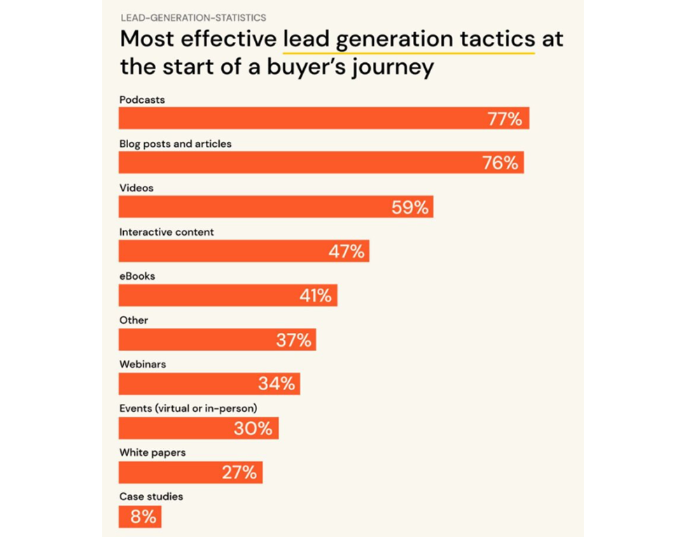
The Emailtooltester research underscores the value of content marketing in web lead generation. A staggering 90% of marketers incorporate content into their strategies, and 66% document their efforts to ensure consistency and quality.
Podcasts, blog posts, and articles have proven particularly effective among content types. For example, 77% of marketing teams find podcasts most impactful in the early stages of the buyer journey, closely followed by blog posts and articles at 76%. These content forms also tie into web design trends — from how brands display articles to how they embed audio. Some even use Brutalism web design, embracing raw, minimalist layouts that make content feel bold and authentic. It proves that presentation matters as much as the message.
Educational content like blogs, whitepapers, and FAQ pages are also powerful tools. Writing a great blog means you provide valuable information and establish credibility as a trusted resource. Those types of content draw in readers as you address their immediate concerns while subtly showcasing your expertise. Instead of a generic blog about email marketing, write a detailed guide on “How to Build a High-Converting Email Campaign,” complete with templates or real-world examples. This level of specificity builds trust and provides immediate value, keeping users engaged and more likely to return.
Community feedback often highlights the importance of structured and visually appealing content. Break up dense text with subheadings, bullet points, or infographics to make your content more digestible. And don’t forget visuals to make complex ideas easier to grasp and more shareable on social platforms.
Every design element should work together to drive website traffic, from color choices and bold CTAs to trust-building features. Visual hierarchy is key to guiding user attention. Highlight critical elements with contrasting colors, use white space to reduce clutter, and structure information logically so users can absorb it quickly. A design that feels effortless often leads to greater engagement. If you’re unsure how to bring these principles to life, learning how to find a web designer or exploring tips on mastering web design can help you identify the right partner or skills to achieve that seamless balance. Whether you decide to hire a website designer or refine your own design process, remember that thoughtful structure and clarity always outperform visual noise.
Trust indicators amplify credibility. Social proof, such as testimonials, success stories, or case studies, can often persuade visitors more effectively than any sales pitch. For instance, Leadpages showcases how thoughtful design can boost conversions. Vibrant colors, large fonts, and intuitive layouts draw the eye to the CTAs: “Build your first landing page today” and “Try It Free.”

The site also features powerful social proof, including testimonials and metrics: “270k+ businesses launched on Leadpages.” Combining these elements helped Leadpages create an engaging, trustworthy experience that inspires action.


A high-performing website is never finished. It’s continuously refined. A/B testing is essential for identifying what works best. Compare small changes, like button colors or CTA wording, to see what drives results. Test one element at a time for clarity and start with high-impact areas, namely CTAs, headlines, or forms. That way, you’ll know exactly what’s driving improvements.
Marketing KPIs like conversion and bounce rates reveal what’s working, while tools like Google Analytics and Crazy Egg provide deeper insights. For example, if a form isn’t converting, reduce fields or offer incentives “Get a free resource.” User feedback is equally valuable.
Quick surveys or heatmaps can highlight overlooked opportunities. If users repeatedly click on an unlinked image, they tell you what they want—listen and adjust.
Many companies still fall short when it comes to targeting the right people at the right moment, both on their website and in search engines. And with 61% of marketers saying lead generation is their biggest hurdle, it’s clear something needs to change. Here’s how to fix it.
If you’re not designing for someone, you’re designing for no one. And we mean understanding them.
That’s why 58% of marketers say buyer personas are critical to their marketing strategies. When you know who you’re speaking to, you can shape your content, layout, and CTAs in a way that feels personalized, not generic.
Let’s say your target is SaaS founders drowning in tabs and task-switching. You wouldn’t waste their time with vague fluff. You’d give them a punchy headline, a clear value prop, and a fast-loading page that says: “We get your chaos. Here’s a fix.”
Want more leads? Design your website like a funnel, not a brochure.
Here’s what high-performing lead-gen pages do differently:
Ever landed on a form that looks like a government application? Yeah, don’t be that site.
The fewer fields you require, the higher your conversion rate will be. It's science. If you really need extra data, use a multi-step form that feels like a friendly conversation rather than a chore.
And don’t guess what to change, test it. Try removing one field. Try adjusting your CTA. These tiny shifts can produce surprisingly big wins.
Behavior-based personalization = lead-gen gold. Someone's scrolled to the bottom of your pricing page twice? Serve up a pop-up offering a success story relevant to their niche.
Someone just read three blog posts? Hit them with a soft CTA offering a free toolkit download.
Keep the conversation relevant and helpful, but avoid being pushy or robotic.
Creating a lead-generating website is part strategy, part science, and part art. When each step is done with care, the result is a website that doesn’t just attract visitors but turns them into loyal customers.
We’ve explored how to craft compelling CTAs, optimize for speed and mobile, and use marketing tools to personalize the visitor journey. But this is just the start. Lead generation websites are evolving, and 2025 is bringing some game-changing trends. Things are about to get interesting. Here’s what to watch for:
You don’t have to adopt every trend or strategy all at once. Start with the essentials: clean design, clear CTAs, and a site that loads fast and works beautifully on mobile. Make the insights work for you. Then, test new ideas one by one. Maybe it’s as simple as adding a chatbot or experimenting with AI-driven personalization, or drawing inspiration from SaaS landing page examples to refine conversions.
If you’re budgeting or planning next steps, explore our guides on website design cost and the website owner’s manual to help you prioritize what matters most and make smarter long-term design investments.
The most critical step? Take action. The internet rewards the bold, and your website is your stage. Apply what you’ve learned here, and keep refining as you go. If you need professional marketing design services support, TodayMade is here to help. Reach out to us to learn how we can help you build high-performance websites.


