18 Best Pop Up Examples and Design Tips


Pop-ups have a bit of a bad reputation. When overused or poorly designed, they can frustrate users and drive them away. But here’s the catch: pop-ups work — and they work incredibly well. Studies show that well-designed pop-ups can increase email sign-ups by up to 50% and boost conversion rates by as much as 9.28%
At TodayMade, we understand that the key to effective pop-ups lies in their design. A pop-up that’s aesthetically pleasing, strategically placed, and perfectly timed can enhance user experience and drive meaningful engagement.
This article dives into the world of pop-ups, showcasing best pop up examples from various industries while sharing actionable design tips to make them more effective. Ready to transform your website’s engagement? Let’s get started!
The success of a pop-up lies in its ability to guide users without disrupting their journey. Striking this balance requires more than just aesthetic appeal — it demands strategic thinking. From timing to placement, every element of a pop-up influences its impact.
Let’s dive into how thoughtful design and strategic implementation transform pop-ups from potential irritants into powerful tools for driving engagement and conversions.
Beyond grabbing attention, pop-ups strategically encourage users to perform specific actions, such as subscribing to newsletters, completing purchases, or downloading resources. For instance, a case study by OptiMonk revealed that implementing exit-intent pop-ups led to a 62% increase in subscription rates for a Hungarian marketing company, Marketing 112.

Design plays a crucial role in determining whether a pop-up enhances or hinders user experience. Poorly timed or irrelevant pop-ups can feel intrusive and damage a website’s credibility. The key lies in striking a balance:
– Timing: Ensure pop-ups appear at appropriate moments, such as after users have engaged with content or when they're about to exit the page. For example, Sleeknote's research indicates that mobile pop-ups shown after a 6-second delay have higher conversion rates than those displayed immediately.

– Relevance: Customize pop-ups to align with user intent, making them feel like helpful suggestions rather than interruptions. A study by Sumo found that the average conversion rate for all pop-ups is about 3.09%, but this rate can increase significantly with targeted and relevant messaging.
At TodayMade, we've observed that thoughtful pop-up design can significantly enhance user experience. Features such as clean layouts, intuitive navigation, and compelling calls-to-action (CTAs) ensure pop-ups integrate seamlessly into the website. For example, Lilach Bullock achieved a 57% conversion rate with a simple, text-only pop-up that aligned with her site's design and messaging.

So, a well-designed pop-up not only respects the user's journey but also enhances it, acting as a bridge between their needs and your goals. How do we know if it’s well-designed? Let’s explore effective pop-up design examples together.
Pop-ups come in many forms, each tailored to specific user behaviors and goals. Below, we explore six popular types of pop-ups, complete with real-world examples and actionable design tips to make the most of them.
These are the friendly greetings of the digital world, appearing when users first land on a website. They’re perfect for offering a warm introduction, discounts, or special deals to new visitors.
Tips for effective welcome pop-ups:
Here are several welcome website pop-up examples:

This website popup offers first-time visitors a 5% discount on their next order. It’s an excellent example of how a small incentive can encourage purchases. Especially for new users exploring the platform for the first time, it will be a pretty warm, welcoming message.

Madewell shows a great pop-up message example. The wording is designed to draw attention, making it clear why users should subscribe and what they stand to gain.
Tentree uses a location-based pop-up to enhance user experience. By asking visitors to confirm their region instantly, the brand avoids wasting time for users in areas where shipping isn’t available.

Pandora’s log-in pop up window example encourages users to sign up or log in before continuing. It highlights benefits like quicker checkout and exclusive offers, demonstrating value for both the user and the business.
These pop-ups are triggered when a user is about to leave the site, aiming to retain their attention with compelling offers or reminders.
Tips for effective exit-intent pop-ups:

This exit-intent pop-up invites users to join a live Q&A session. It’s an effective way to re-engage users who are about to leave, providing them with valuable interaction opportunities.

Another example of an exit-intent pop-up, Picreel uses bold text to communicate the value users might miss out on by leaving the site. The design immediately captures attention and emphasizes value.

HidrateSpark pairs a discount offer with a real user testimonial, effectively combining monetary value with social proof. This strategy can persuade hesitant users to reconsider leaving the website.
Designed to grow your email list or gather valuable customer information, these pop-ups often offer incentives like free downloadable resources or exclusive access.
Tips for effective lead generation pop-ups:

Designed by TodayMade, Eleken’s scroll-triggered pop-up promotes a free eBook relevant to the blog content. It’s visually appealing, clearly communicates the value, and blends seamlessly with the site’s design.

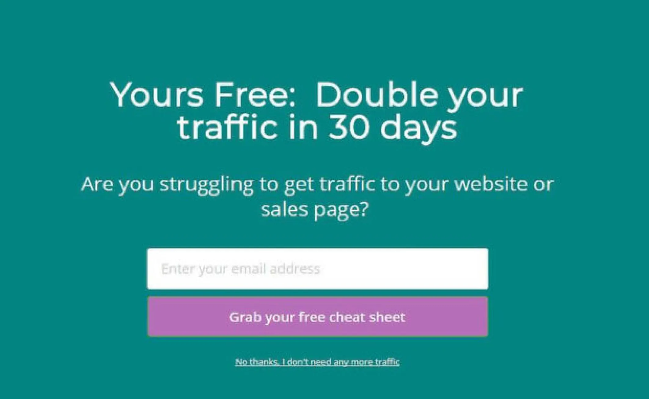
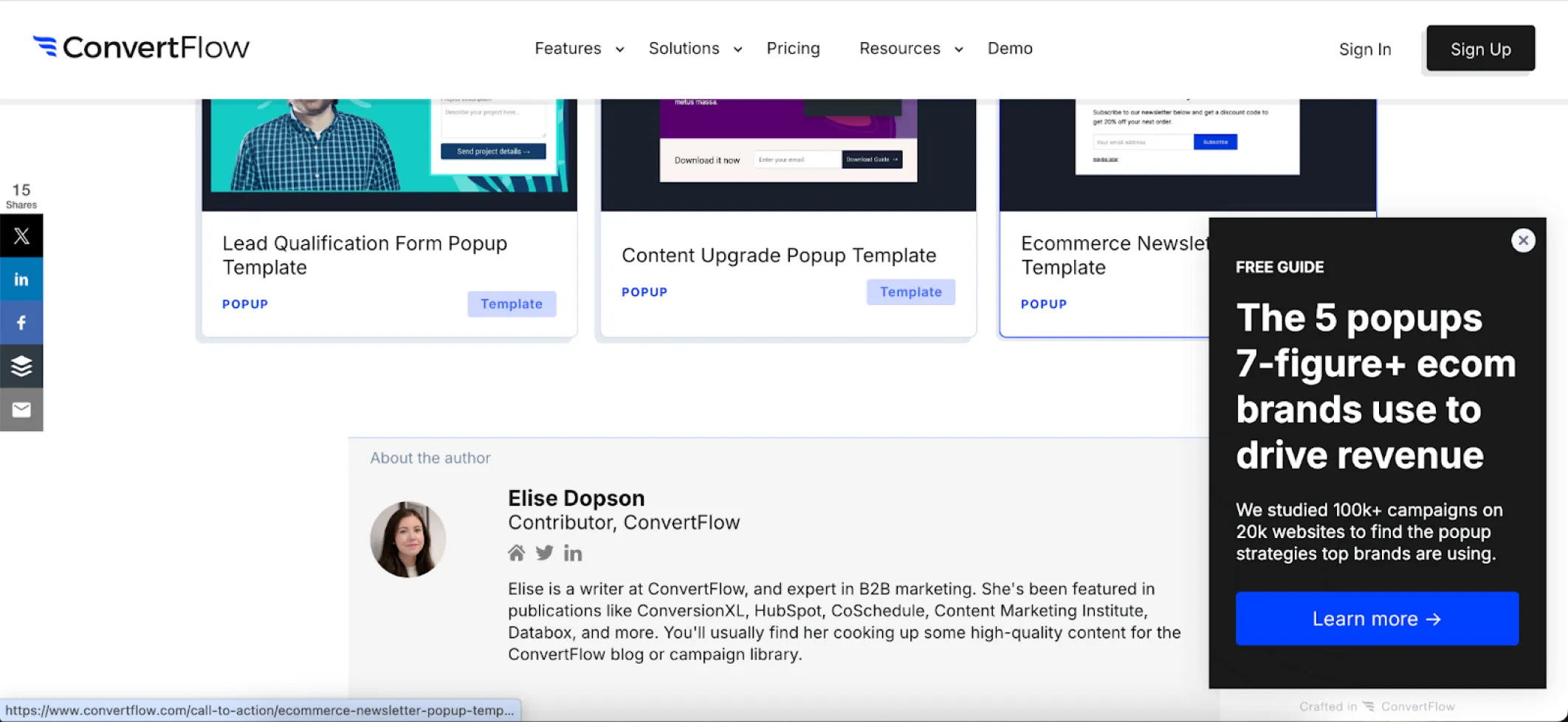
ConvertFlow offers a lead-generation pop-up with a free guide. The design is visually striking, and the minimal input required (just an email address) makes it an appealing and effective approach.

The large pop-up ensures visibility, while the smaller version provides a less intrusive option.

Incu goes beyond simple email collection by also gathering names and shopping preferences (menswear or womenswear). This additional data enables highly personalized email campaigns. The pop-up effectively lists the benefits of joining the community, such as exclusive offers and updates, providing compelling reasons for users to subscribe.
These are used to showcase flash sales, special promotions, or exclusive deals.
Tips for effective sale pop-ups:
So, let’s take a look at some pop up ads examples.

Elfsight’s small, unintrusive pop-up effectively informs users about their Black Friday sale. The design is compact yet attention-grabbing, ensuring users don’t miss the ongoing seasonal offer without cluttering the website.
By the way, we’ve got plenty of last-minute Black Friday marketing ideas gathered in one place.

This pop-up leverages urgency and exclusivity by including a countdown timer and messaging like “it’s yours.” The combination motivates users to act quickly, making it an excellent example of how time-sensitive discounts can drive sales.

Senja uses a pop-up to inform visitors about an upcoming webinar. This approach ensures maximum visibility and boosts attendance by quickly engaging users and presenting the event details at a glance.
These pop-ups gather user feedback to improve services or products, typically in a non-intrusive manner.
Tips for effective survey pop-ups:

Chanty’s minimalistic survey pop-up is simple yet effective. It gathers valuable insights from website visitors without disrupting their browsing experience, proving that less can indeed be more.

Kiss My Keto’s colorful and engaging design captures attention. Offering a discount in exchange for completing a quick survey is a clever strategy to collect valuable customer information while incentivizing immediate purchases.

Google Meet’s pop-up appears right after a meeting ends, ensuring the perfect timing for gathering user feedback. This NPS (Net Promoter Score) survey is a classic yet essential tool for measuring customer satisfaction.

Refiner’s survey pops up while users are reading relevant blog content, enabling precise targeting. It’s a great way to gain insights into user behavior and preferences while keeping the interaction natural.
These pop-ups add an element of fun by gamifying the user experience, such as spin-the-wheel or quizzes.
Tips for effective gamified pop-ups:

Press uses gamification to engage visitors with its “Spin to Win” pop-up. This interactive design not only entertains but also encourages email collection by offering discounts and freebies, increasing the likelihood of user participation.

Gamification is a powerful tool to engage users, and this scratch card pop-up is a prime example. Visitors are invited to “try their luck” by scratching to reveal a special offer. Putting such pop-ups on websites — along with spinning wheels or surprise boxes — add an element of fun that encourages participation and drives conversions.

This interactive pop-up transforms the typical experience into a short quiz, asking whether users are shopping for home or business. This simple interaction boosts engagement, provides valuable insights, and ensures the offer feels personalized to the shopper’s needs.
Of course, there are many more types of popups that serve a variety of purposes, but there are some universal tips that will help you make any of them effective.
After exploring the different pop-up banner examples and their use cases, the next question is: how do you ensure your pop-ups succeed without annoying your visitors? The right strategy isn’t just about what kind of pop-up you use, but also how you implement it.
Let’s dive into the best practices to help you design pop-ups that not only capture attention but also respect the user experience.
To ensure website pop ups enhance user experience without overwhelming visitors, it's crucial to limit their frequency and timing. While there's no one-size-fits-all number, best practices suggest:
This approach helps maintain user engagement without causing frustration.
Generic pop-ups fail to capture attention. Use data like browsing history, geographic location, or referral source to tailor the content. For example:
You can use special tools to segment audiences and deliver tailored messages (we will talk about them a bit later in this article).
Poorly timed pop-ups can feel intrusive and drive users away. Instead:
Pop-ups shouldn’t irritate users. To make them feel seamless:
A cluttered or overly complex pop-up confuses users. Instead:
Pop-ups that work well on desktops often fail on mobile devices. Make sure your designs:
Use responsive templates that scale appropriately for all devices.
This point is rather important: every audience is unique, so what works for one site may not work for another. A/B testing is essential to optimize:
Regularly analyze important marketing KPIs like conversion rates and exit rates to refine your strategy.
Bringing your pop-up ideas to life doesn’t have to be expensive or time-consuming. With the right tools, even a beginner can create professional, high-converting pop-ups. Here are some of the best tools to help bring your pop-up strategy to life without breaking the bank.
1. OptinMonster

2. Canva

3. Wisepops

4. Poptin

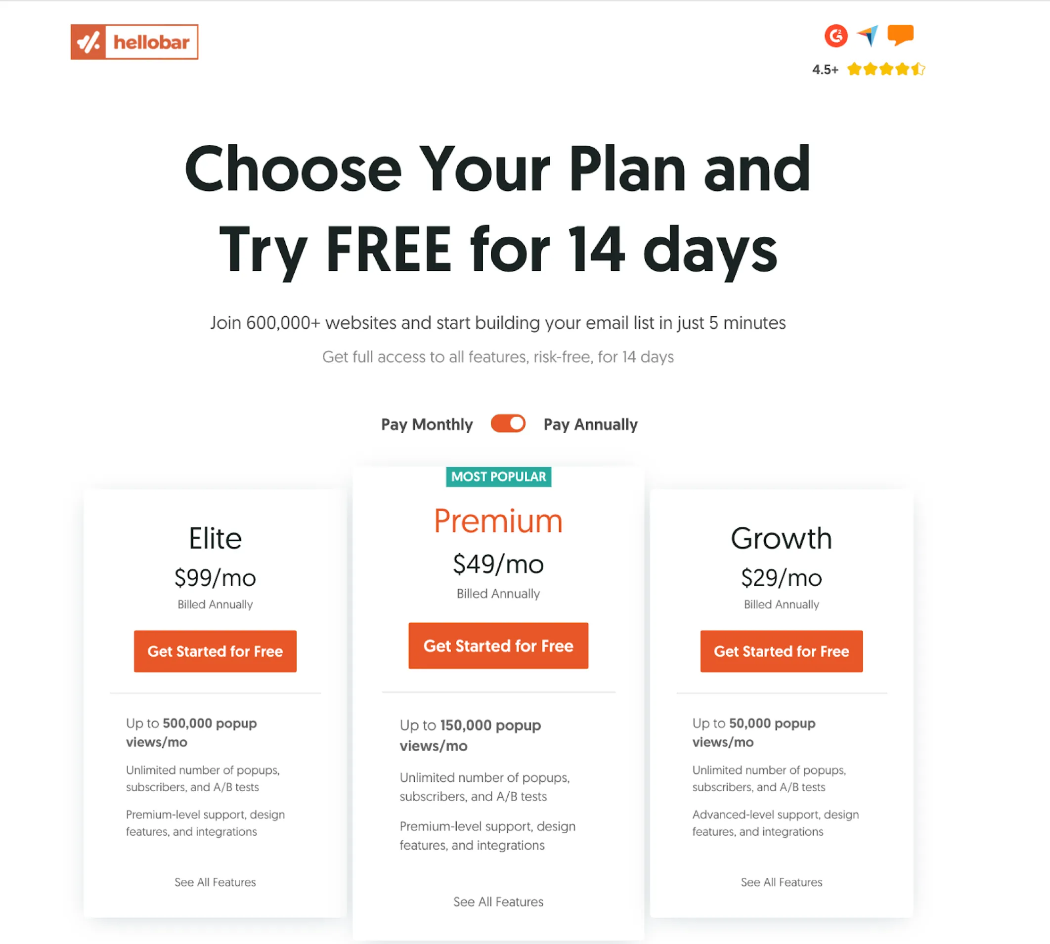
5. Hello Bar

These tools allow you to create, customize, and optimize pop-ups that convert, whether you’re running a personal blog or managing a large-scale e-commerce site.
Ready to take your designs to the next level? Further, we’ll discuss how to collaborate with marketing designers to create pop-ups that go beyond templates and truly reflect your brand’s personality.
While tools can help you create effective pop-ups quickly, there are times when your needs go beyond pop ups templates. Whether it’s ensuring seamless integration with your website’s design or crafting a unique experience for your audience, working with a professional designer can elevate your pop-ups to the next level.
Here’s how to collaborate effectively with designers to achieve outstanding results:
A clear brief helps the designer understand your vision and deliver results that meet your expectations. Include the following:
Your choice between a freelancer and a design agency depends on the scope, complexity, and budget of your project, but understanding the strengths of each option will help you make the right decision.
Freelancers:
Design agencies:
Considerations:
As you can see, both freelancers and agencies have their own limitations and compelling benefits. But what if I told you there’s an option that combines the strengths of both — a solution that’s cost-effective, capable of handling tasks of any complexity, delivers results quickly, and works for both small and large-scale projects?
That’s TodayMade:
So, whether you’re launching a single campaign or need ongoing design support, TodayMade is equipped to deliver high-quality pop-ups that drive engagement and conversions — on time and within budget. Contact us today to discuss your design needs.


